One Pager Design
Good one pager design puts the most important line first and keeps everything else calm. Use one typeface family in two weights, a title of about 26 to 30 points, body text no smaller than 9 points, half-inch margins, and one brand color with dark text. Leave space between sections so the page can be scanned quickly.
Type sizes, margins and spacing
These are the numbers the maker on this site uses on a Letter or A4 page. They are not industry law, but they come from a tool that measures every line it sets, and they hold up in print.
| Element | Size in the maker | Why |
|---|---|---|
| Title | 30 points, down to about 26 | The first thing the eye finds, readable at arm's length |
| Tagline | 14 points, down to 12 | Clearly second to the title, clearly above the body |
| Section headings | 13 points bold, down to about 11 | Weight, not size, separates them from the text |
| Body text | 10.5 points, never below 9 | Below 9 points, print gets hard to read for many people |
| Contact lines | 9.5 points, down to about 8 | Short lines that are looked up, not read |
| Footer line | 7.5 points | Present, never competing |
| Margins | Half an inch (36 points) on every side | Many office printers cannot print to the very edge |
| Line spacing | 1.35 for body text, 1.15 for headings | Open enough to scan, tight enough to save space |
| Paragraph spacing | Half a line after each paragraph, 12 points between sections | The gaps show where one idea ends |
When the words run long, the maker does not squeeze one box. It scales every size on the page down together in steps of 2 percent and stops at 86 percent, which is where the body reaches 9 points. Within its section limits the page always fits at or above that floor, so the hierarchy survives intact. The writing side, from the reader to the call to action, is covered in how to make a one pager.
Color and contrast
Pick one brand color and give it a job: a band, the rules under headings or the headings themselves. Leave the reading to dark text on white. A second color, if you use one at all, is an accent for one element, not a theme.
Put white text on the brand color only when the pair reaches a contrast ratio of 4.5 to 1, the WCAG AA level for normal text. Many favorite brand colors miss it: coral, orange and yellow usually need dark text instead. The maker checks every color you pick, uses white or near-black text, whichever reads better, and darkens your color slightly when neither reaches 4.5 to 1. Before printing in color, look at the page in grayscale. If the structure disappears, the color was carrying too much.
Fonts
Use a sans serif for the text: it stays clear at small sizes on screen and on office printers. A serif can work for headings when the page should feel traditional, as for a law firm or a literary event. Two weights, regular and bold, are enough for the whole page; more than two typefaces usually looks unplanned.
On screen and in the PDF, the maker's sheet uses Arimo, with Gelasio for its serif headings option. The Word and PowerPoint files name Arial and Georgia instead, which have the same character widths, so the text breaks the same way when you open the file on a computer that has them.
Six layouts for business one-pagers
Each layout below is the wireframe from the maker's layout picker, with coral marking where it puts the brand color. Choose by the shape of your content, then let the layout make the decisions about spacing.
-
Classic
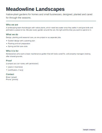
One column under a thin color bar, with the logo at the top left. Best for text-led pages that read top to bottom, like a short memo.
-
Two column
Sections flow in reading order from a wider left column into a narrower right one, balanced so both end at about the same height. Best for dense content.
-
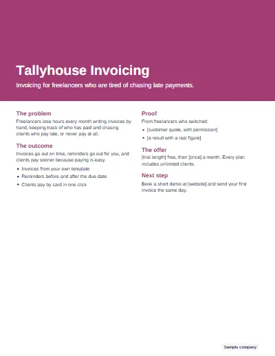
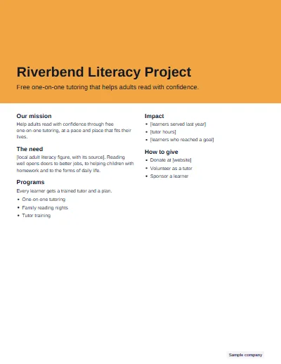
Hero band
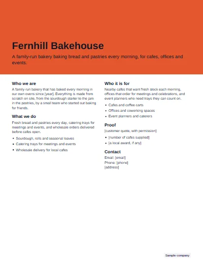
A full-width band of brand color holds the title, the tagline and the logo, with the sections in two columns below. Best for brand-led pages.
-
Card grid
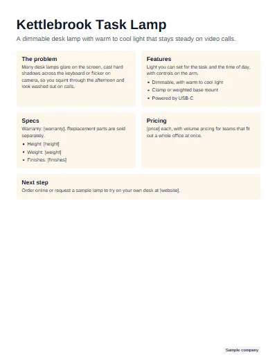
Each section becomes a lightly tinted card, two to a row. Best when the page has several equal parts, such as features or programs.
-
Sidebar
A left column in the brand color, about a third of the width, carries the tagline, quick facts and contact details. Best for offers and listings.
-
Minimal
No color blocks at all: the brand color appears only on the headings and one thin rule under the title. Best for formal pages.
Six design ideas for classroom one-pagers (for teachers)
These are ideas to show students before they start. None of them needs drawing talent; each one gives the page a structure that carries meaning. For printable starting points, see the one pager layout ideas, and for assignment topics by subject, the one pager ideas.
One strong central image
Show students a page built around one large symbol in the middle, such as a key for a story about secrets or a scale for a court case. Every box on the page then connects back to it, so the design explains the main idea before anyone reads a word.
A quote ribbon around the border
Have students write a key quote in small letters around the whole edge of the sheet, like a ribbon. It fills the border with meaning instead of decoration, and choosing the quote is itself a reading task.
Color with meaning
Ask students to give each color a job: one color per character, per theme or per side of a debate. A small key in a corner explains it. Readers can then follow an idea across the page by color alone.
The title as lettering
Let the title become the page's art: block letters filled with small drawings, or the letters shaped like an object from the text. It works well for students who prefer words to pictures.
A border that repeats a key word
A single word that sums up the theme, written again and again around the edge, frames the page and keeps the student's focus on that one idea. "Ambition" for Frankenstein, "cycle" for a science unit.
Boxes sized by importance
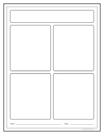
Teach students to give the biggest box to the biggest idea and smaller boxes to supporting details. The layout becomes an argument about what matters most, which is a good thing to grade.
Print or screen
Send a PDF for email and for printing: it keeps the fonts, colors and layout identical on every device. Use a PNG when the page has to sit inside a slide deck or a social post, keeping in mind that the text in an image cannot be selected, searched, edited or read aloud by a screen reader. Keep the Word or PowerPoint file as your editable master. Before a big print run, print one test page on the actual printer: colors shift on paper, and thin rules can vanish.
Common design mistakes
- Too much text. The fix is cutting, not shrinking. Remove a section before you reduce the type.
- Body text under 9 points. Go back to 9 or more and cut words to make the room.
- More than two fonts. One family in two weights gives enough contrast for any one-pager.
- Low-contrast color. White on light orange or gray on gray fails. Check for 4.5 to 1, or switch to dark text.
- Images of text. A screenshot of a paragraph cannot be read by a screen reader or found by search. Set the words as real text.
- A second page. If it needs a back, it is not a one-pager anymore. Move detail to a website or a follow-up document.
To see finished pages that avoid all six, browse the one pager examples.
Questions
What makes a good one pager design?
A clear order of importance: one headline that stands out, short sections that are easy to scan, and enough white space that nothing feels crowded. Consistent type and one brand color hold it together, and a single call to action tells the reader what to do next. Decoration comes last, if at all.
What font size should a one pager use?
For a printed Letter or A4 page, body text of 9 to 11 points stays readable, headings of 11 to 14 points separate sections, and a title around 26 to 30 points leads the page. The maker starts at 10.5-point body text and never goes below 9 points when it fits a long page.
What colors work best on a one pager?
One brand color plus dark text on white works best. Use the color for a band, rules or headings, not for long text. If you put white text on the color, check the contrast reaches at least 4.5 to 1; the maker checks this and darkens your color slightly when it falls short.
What is the best file format for a one pager?
PDF for sending and printing, because it looks identical everywhere. Word or PowerPoint when someone needs to edit the text later. PNG when you want to post the page as an image in a slide deck or on social media, though the text in a PNG cannot be selected or read by screen readers.
How do you design a one pager for a school project?
Start with one strong central image or symbol and a large title, then give each required element its own box: quotes, theme, analysis and connections. Use color with meaning, for example one color per theme, and keep the writing large enough to read from a desk away. A printed layout helps students who dislike drawing.
Should a one pager have images?
Only images that carry information: a product photo, a simple diagram, a logo, or a chart with real figures. Decorative stock photos take space your words need. On a classroom one pager the reverse is true, because drawn symbols are part of the assignment and show the student's thinking.
How much white space should a one pager have?
Enough that each section reads as its own block: half-inch margins, clear gaps between sections, and short line lengths in columns. If the page looks full from arm's length, cut words rather than shrinking the margins. The maker keeps fixed margins and spacing and reduces type only within its set limits.